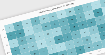
ユーザーは、色の強度を使用してデータセット内の大きさを表す2つの変数の傾向を簡単に識別可能
英語で読み続ける:
A heatmap is a data visualization tool that uses color intensity to represent magnitude within a dataset. This allows for quick identification of patterns and trends across two variables, depicted on the map's axes. Heatmaps are valuable for analyzing geographic data, user website interaction, and any other scenario where you need to visually grasp the distribution of data points.
Several Blazor chart controls offer Heatmaps including:
- ComponentOne Charts for Blazor (part of ComponentOne Studio Blazor Edition by MESCIUS) empowers Blazor apps with interactive heatmaps for data exploration.
- FusionCharts Blazor Suite XT provides a rich set of heatmap chart types for versatile data presentation.
- Syncfusion Blazor Chart (part of Syncfusion Essential Studio Enterprise) offers comprehensive heatmaps with customization options for clear data visualization.
- Infragistics Blazor Charts (part of Infragistics Ignite UI) facilitates creating heatmaps with conditional formatting to highlight specific data ranges.
For an in-depth analysis of features and price, visit our Blazor chart controls comparison.